Introduction to Color Theory in Culinary Arts
Understanding Basic Color Principles
Color theory, a fundamental concept in art and design, applies just as much to the culinary world as it does to painting or graphic design. At its core, color theory is about how colors interact and the emotional responses they evoke. In the kitchen, understanding basic color principles—such as the color wheel, complementary colors, and color harmony—can transform a simple meal into a feast for the eyes.
Why Color Matters in Food Presentation
Our perception of food starts with sight before taste or smell. A well-presented dish that uses thoughtful color combinations can stimulate appetite, set a mood, and even suggest the flavors within. Vibrant colors can signal freshness and quality, while balanced hues contribute to an elegant dining experience. Paying attention to color isn’t just about aesthetics; it can actually heighten the overall enjoyment of the meal.
Essential Color Schemes for Dinner Presentation
Complementary Colors in Plate Design
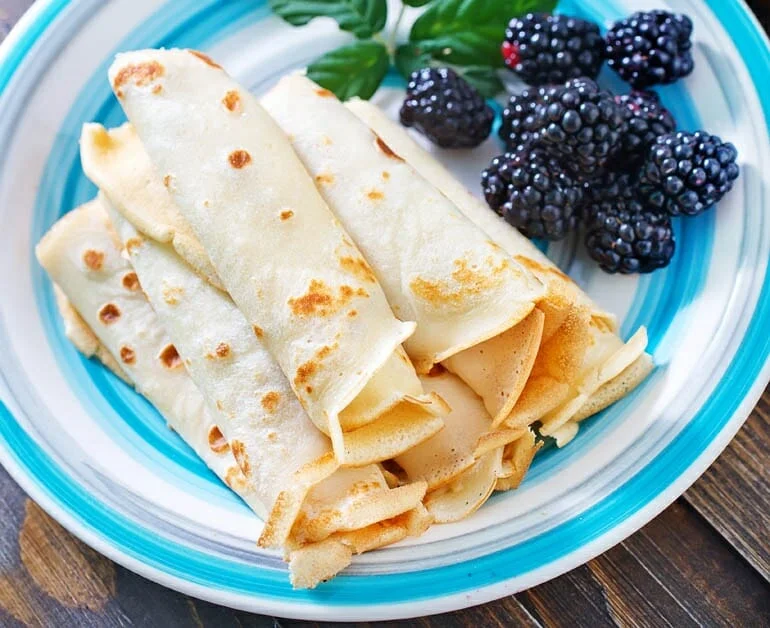
Complementary colors sit opposite each other on the color wheel—think red and green or blue and orange. When used in tandem on a plate, these colors create a striking contrast that immediately catches the eye. Incorporating complementary colors can make ingredients pop, offering a dynamic look that energizes the presentation. For example, a rich tomato sauce served alongside a vibrant green herb garnish is a classic use of complementary colors enhancing appeal.
Analogous Colors for Harmony
Sometimes subtlety wins the day. Analogous colors are those adjacent to each other on the color wheel, such as yellow, orange, and red. This scheme produces a harmonious, natural feel that’s soothing and pleasant. Using analogous colors in your dinner presentation creates a seamless flow and unity on the plate, ideal for dishes where you want a cohesive, elegant look without aggressive contrasts.
Using Triadic Colors for Vibrancy
Triadic color schemes involve three colors evenly spaced around the color wheel, like blue, red, and yellow. This approach brings vibrant energy and boldness to a dish. When used thoughtfully, triadic schemes balance contrast and harmony, ensuring the plate looks lively without becoming chaotic. This is perfect for chefs wanting to wow guests with colorful, stimulating presentations.
Step-by-Step Process to Apply Color Theory on Your Dinner Plate
Step 1: Select a Color Palette Based on Your Dish
Start by identifying the dominant colors in your main ingredients. Are you working with rich greens, deep purples, or warm reds? From here, decide on a color scheme that complements or contrasts with those hues based on the mood you want to convey. A cohesive palette sets the foundation for the entire presentation, making future choices easier and more intentional.
Step 2: Choose Ingredients to Match or Contrast Colors
With your palette in mind, select additional ingredients that either align with or offset your base colors. For instance, pairing bright orange carrots with creamy white potatoes introduces contrast, while adding roasted beets alongside red cabbage embraces analogous tones. This step requires a balance between creativity and knowledge of natural ingredient colors, allowing you to create visual interest while maintaining flavor harmony.
Step 3: Plating Techniques to Enhance Color Impact
How you arrange ingredients on the plate can magnify color effects. Leaving some negative space helps colors breathe and stand out. Layering lighter colors over darker backgrounds or using asymmetry can draw attention to the most vibrant elements. Remember, a carefully executed layout guides the diner’s eye and emphasizes the color story you’ve crafted.
Step 4: Final Touches and Garnishes for Color Balance
Garnishes are more than mere decoration—they can be the final punctuation in your color composition. Fresh herbs, edible flowers, or a drizzle of brightly colored sauce can add a splash of unexpected color and texture. The goal is to achieve balance so that no single color overwhelms, but instead, all components work together to create a visually stunning plate.
Case Studies: Successful Vibrant Dinner Presentations
Classic Meals with Color Theory Application
Think of a traditional caprese salad: the rich red of ripe tomatoes, creamy white mozzarella, and fresh green basil perfectly demonstrates complementary and analogous color use. This familiar dish not only tastes delightful but also visually stimulates appetite through its vibrant and balanced colors. Similarly, classic French ratatouille uses a triadic color approach with yellows, reds, and greens, turning humble vegetables into an artistic masterpiece.
Modern Twists Using Unusual Color Combinations
Contemporary chefs often experiment with unexpected color pairings to surprise and delight diners. Imagine a dish combining purple cauliflower, orange turmeric-infused grains, and green microgreens. These bold choices, inspired by triadic and complementary principles, create visual intrigue and invite curiosity about flavor profiles. With modern plating trends emphasizing creativity, color theory becomes an essential tool for pushing culinary boundaries.
Common Mistakes to Avoid When Using Color in Food Presentation
Overcrowding the Plate
One of the biggest pitfalls is stuffing too many colors and ingredients onto a single plate. This can overwhelm the diner and dilute the impact of your carefully chosen palette. Sometimes less truly is more—giving colors space to shine makes the overall presentation more sophisticated and appetizing.
Ignoring Natural Color Variations
Not all colors are created equal. Lighting, cooking methods, and ingredient freshness can alter hues dramatically. Ignoring these variations can lead to dull or mismatched presentations. It’s important to consider how colors might change through preparation and to adjust your palette choices accordingly.
Failing to Consider Lighting and Environment
Colors look different under various lighting conditions. A vibrant plate under warm incandescent light may appear washed out under cooler fluorescent lighting. Serving environment—table color, background, and even the type of dishware—plays a role in how colors are perceived. Being mindful of these factors ensures your vibrant presentation is appreciated as intended.
Bonus Tips for Enhancing Visual Appeal Using Color Theory
Pairing Drinks and Plates for Cohesive Color Experiences
Integrating drink selections that complement your color palette can elevate the entire dining experience. For example, a deep red wine next to a plate featuring rich reds and purples enhances color harmony extending beyond the plate. This thoughtful coordination leaves a lasting impression and engages multiple senses.
Using Tableware and Linens to Complement Food Colors
Don’t underestimate the power of your setting. Choosing plates, napkins, and tablecloths that echo or contrast with your dish’s colors can amplify vibrancy or provide a calming backdrop. Clean white plates are a classic choice that highlights colorful food, but experimenting with colored or textured tableware can add an extra dimension to your presentation.

