Introduction to Color Harmony in Culinary Presentation
Why Color Matters in Food Presentation
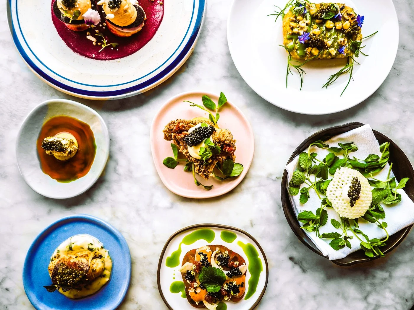
When you sit down to enjoy a meal, the first thing that catches your eye isn’t just aroma or texture—it’s color. The way colors are arranged on your plate can turn an ordinary meal into a feast for the eyes. Color draws attention, sets expectations, and even influences how we perceive taste. A well-balanced palette can make dishes look fresher, more appetizing, and more thoughtfully prepared.
The Psychological Impact of Color on Appetite
Colors evoke emotions and can trigger specific cravings. Warm hues like reds and oranges tend to stimulate hunger, while cooler colors such as blues and purples might suppress it. This is why red is such a popular color in food marketing. Understanding these psychological effects can help you design meals that not only taste great but also enhance the entire eating experience.
Fundamentals of Color Theory for Cooking
Understanding the Color Wheel
The color wheel is a simple circular diagram that organizes colors in a way that shows their relationships. Recognizing these relationships is key to mastering color harmony on your plate. Whether you’re combining vegetables, fruits, or sauces, knowing which colors naturally complement each other can elevate the visual appeal of your dishes.
Primary, Secondary, and Tertiary Colors Explained
Primary colors—red, blue, and yellow—are the foundation of all other colors. Mixing two primes creates secondary colors like green, orange, and purple. Tertiary colors emerge from blending a primary with a secondary, offering subtle shades that can add nuance to your presentation. By understanding these groups, you can intentionally select ingredients that create a balanced and harmonious look.
Step 1: Selecting a Color Palette for Your Meal
Choosing Complementary Colors
Complementary colors lie opposite each other on the color wheel and create vibrant contrasts when paired together. Think bright red tomatoes against green basil or purple cabbage next to orange carrots. These combinations naturally draw attention and make each element stand out, adding excitement to your plate.
Analogous and Triadic Color Schemes in Dishes
Analogous colors sit close to each other on the wheel, such as yellow, yellow-green, and green. These combinations offer a harmonious, soothing effect that feels cohesive and appealing. Triadic schemes use three colors evenly spaced around the wheel, like red, blue, and yellow, introducing balance with a bit more energy. Both approaches are fantastic tools for creating meals that are visually stunning without overwhelming the senses.
Step 2: Balancing Colors on the Plate
Incorporating Contrast and Harmony
A great plate balances bold contrasts with harmonious blends. Think of the vibrant pop of a cherry tomato set against creamy mozzarella. This contrast sharpens the visual appeal. At the same time, complementing colors in side dishes or sauces can create a sense of unity, inviting your diners to explore every element without distraction.
Using Neutral Colors as Backgrounds
Neutral tones like whites, creams, and browns play an important supporting role. They act like a canvas, allowing your brighter ingredients to shine. For example, a bed of fluffy rice or a smooth puree can provide a neutral backdrop that enhances the vibrancy of colorful vegetables or sauces placed on top.
Step 3: Textures and Shapes Enhance Color Perception
Combining Visual and Textural Elements
Color doesn’t exist in isolation on the plate. The texture of ingredients can change how we experience color. Glossy, shiny components like glazed carrots reflect light differently than matte, rougher textures like grains or nuts. This contrast creates depth and interest, making colors come alive in new ways.
How Shape Influences Color Impact
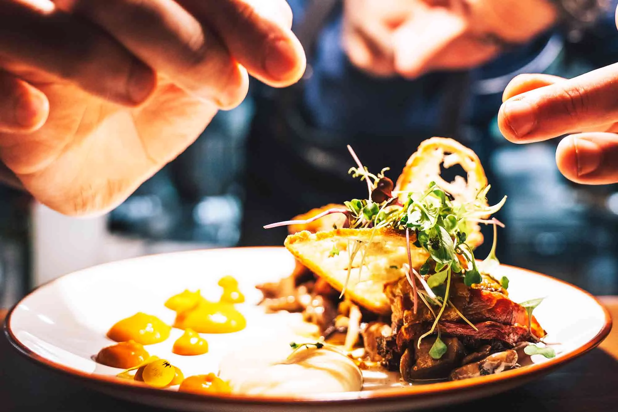
Shapes influence how colors are perceived too. Round elements, such as berries or cherry tomatoes, bring softness and vibrancy, while angular or sliced pieces like carrot sticks or radish slices offer sharpness and structure. Mixing shapes strategically can guide the eye and emphasize certain colors, reinforcing your intended harmony.
Step 4: Practical Examples and Recipes
Breakfast Bowls with Vibrant Hue Combinations
Start your day with breakfast bowls that combine bright fruits, creamy yogurt, and crunchy granola. Picture the deep purple of blueberries beside the sunny orange of mango cubes. These combinations not only look inviting but also provide a balanced nutritional profile that delights both the eye and palate.
Colorful Salads That Pop
Salads are a wonderful playground for color harmony. Mix leafy greens with red bell peppers, golden beets, and purple cabbage for a rainbow of hues. Toss in citrus segments or edible flowers for added bursts of color and freshness. The harmony here encourages people to savor every bite.
Desserts Designed with Color Harmony
Desserts don’t have to be monotonous beige or brown. Think pistachio-green cakes garnished with bright red raspberries or creamy white panna cotta topped with vivid berry coulis. These well-thought-out color combinations add elegance and anticipation to the final course.
Tips for Achieving Color Harmony in Any Cuisine
Seasonal Ingredients to Maximize Color Range
Using seasonal ingredients is a smart way to ensure your colors are fresh and vibrant. Spring offers brilliant greens and pinks, while autumn brings warm oranges, reds, and yellows. Aligning your palette with the seasons naturally introduces a pleasing authenticity and variety to your meals.
Utilizing Edible Flowers and Garnishes
Edible flowers and fresh herbs are simple yet effective tools for adding unexpected pops of color. Tiny nasturtiums, violets, or sprigs of dill can transform a dish from ordinary to extraordinary. These accents can elevate your presentation and highlight your ingredient palette beautifully.
Common Mistakes to Avoid When Mastering Color Harmony
One common pitfall is overloading the plate with too many competing colors. While variety is good, an excess can be visually confusing and reduce the overall impact. Another is ignoring neutral tones; without them, your dish may look chaotic rather than artfully composed. Lastly, neglecting the role of texture and shape can make your colors feel flat and uninspired. Taking a moment to consider all these factors before plating will help you avoid these mistakes.
Conclusion: Elevate Your Meals Through Visual Appeal
Mastering color harmony is about more than just aesthetics; it’s about creating an inviting, memorable experience. Thoughtful color choices can enhance appetite, highlight the freshness of your ingredients, and tell a story on every plate. By understanding the basics of color theory and applying them practically through selection, balance, and texture, you can transform everyday meals into impressive culinary creations that delight both the eyes and the taste buds.